Wednesday, 28 April 2010

LECTURE: Russell Hancock


All images :
http://www.russellhancock.com/index.html

Russell Hancock came in yesterday and what a delight! A young, enthusiastic and inspirational designer who has worked on various large and small companies including, The Gadget Shop and Mentos.

After graduating in 2006 from Falmouth, he has worked both Free-lance and Self employed and his lecture was to give us an insight to how you should approach and work with clients, and the difficulties you may endure in doing so.

He has had non paid experience and well paid experience so it was great to hear the reality of a design graduate and all that we have to look forward to! Just some of his main advice was:

-Really listen to good clients, what they are saying will get you business.
-Show your mum (every opinion counts)
-Make yourself in-disposable
-Get your money and a signature upfront
-Getting people to pay for design is not easy!
-Be aware of when to step in with your opinion
-Asses free work carefully
-Remember people / Be remembered
-Become organised

-Get out and Socialise!

I liked his attitude - he was a down to earth character who new the business and how difficult it really is. What I admire about him and Craig Oldham alike is their pure honesty. There's no bullshit - they say it like it is. And personally I want to hear it like this. It is all good and well having fantastic Lecturers in but as we are so close to finishing we need to hear the reality of the Industry.

His work was also as enthusiastic and creative as his personality. He had some really nice work to show, my main favourite was The Gadget Shop as it was really interactive and original. (See images above).
I also liked his attitude to working with small/local business and it was good to hear another creative say that London really isn't the answer to inspiring creative's. The work he has done for the local cinema was also a favourite of mine, using his own initiative he successfully filed his own campaign to improving the building - although being rejected he continued to push and get to a stage he was happy with. Resulting in now working with the new owners to designing and branding the new concept and development.

"Have a life outside of design" was his last point he raised and I hope that after we graduate I can also begin to get my life back and start to enjoy the little things again...


DESIGN RESPONSIBILTIY


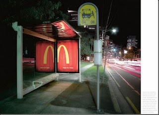
A new poster campaign I found recently, very inspiring and influential for young designers.

McDonalds : Early Mornings


As part of my research for the METRO brief, it reminded me of the 2009 adverts for McDonalds where they were advertising the new early morning time openings they were starting. The advert has individuals going to work but doing really obvious things wrong e.g. walking up the escalators the wrong way etc. I personally think it is really good, it makes me people more aware of what McDonalds can do for you and how it can improve your life.

It reminded of an idea I had, e.g. 'Start the day with Metro' a very obvious and not the most exciting or motivational!!

Monday, 26 April 2010

PROJECT: METRO

I am currently working on the D&AD : Metro brief which requires you to create a transport advertising poster campaign and strapline that cuts above through the visual noise of the everyday commute to promote Metro newspaper.

Target audience is 18-44 urbanities who are trend savvy, love to socialise and they have a higher than average income. They will live or work in the city centre so they are time starved, media literate and love new trends.

Considerations are to promote Metro to readers as they best was to get up to speed with the latest news in the morning, start to think of the Metro as a personality rather than a product utility and encourage loyalty.

Over the weekend I did some research into the Metro and it is interesting to see why they are so popular. Distributed over 33 cities with around 3.5 million readers, it is the third biggest weekday newspaper.
I also looked at several reviews to get a general feeling of what people though.
This is my favourite:

Steven B.

North Lanarkshire

"The Metro.
It's like a friend who travels everywhere with you.
It has a good layout which makes it easy to dip in and of all your favourite sections, with my favourite being The Ridiculant and is 100% free.
There's a Metro on virtually every bus and train, which seem to magically appear every morning before your local commute.
There's a high volume of laughs in the paper, mainly from wacky letters sent in from Joe and Josephine Public and it is of a high quality overall, for a free paper.
So yeah there are a wealth of advertisements, but hey, it's all relative.
As Scottish as a can of Irn Bru."


Feast your eyes on some of the main images from my research:


I particularly love these from intwo design.com, clever and executed beautifully.


I seriously can't get enough of installation, ambient advertising I love how it communicates with the viewer and makes a response of 'arrrggghhhh'.


I also love these (artist unkown), visually really strong, the typography really stands out and plays with the actual meaning. Brilliant!

Saturday, 24 April 2010

DEGREE SHOW: FUNDRAISING EVENTS: D&AD FOOTBALL

Last night was the D&AD Football fundraising event. The third year boys had organised it and had arranged football shirts for everyone to wear, they got the tutors involved and even Wini Tse (Code Computer Love).

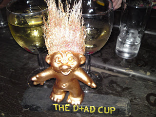
It was a huge success, probably the funniest thing all year!!! They raised over £200 from the event so thanks to everyone who came and supported the lads in their shorts. Team captains Hitch and John Walsh received the gold plated troll as the score was a draw, and Chris Scanlon won a gold show for best number of goals.

Here's a few images high lighting the main epic moments:


Friday, 23 April 2010

PORTFOLIO CRIT : Love Creative

As part of the portfolio crits organised by Hitch, I had one yesterday with Love Creative, following this I will have one with Adrian Shaughnessy next week.

It really is exciting to be able to have the opportunity to show creative agencies my book and it is all in preparation for the following few weeks as we apply for jobs/work experience.
The Love Creative agency is one that I admire and aspire to work in, the whole nature of their work and ethics is an environment where any young creative person should want to work in. They have worked on some major clients including Umbro, Dr Martins, Nandos, BBC and Playstation. Their work is highly creative - it is funny, clever, brilliant and visually stunning. Prior to the portfolio crit I did extra research about their work and I found it even more impressive as you scroll through their website. Which is equally as impressive and totally different from any other agency I have seen. Take a look at : http://www.lovecreative.com/#

So, the portfolio crit went really well! I was pleased that we had a personal interview with the Creative Director Phill Skegg and Chris Myers as I find it easier to talk and create a relationship with them. The office building they are situated in is a really nice, creative environment and we were shown round the floor they share with The Neighbourhood. It was light, inspiring and looked like a real agency environment. The creative team was mostly males....with one female as the studio manager, no surprises there then!?

I enjoy presenting my work and I am able to talk about my projects confidently, and I think that this was clear to them as they said I was a great communicator who was very professional when talking. They also liked the fact that I had actual live projects in (GMP and NoiseLab) and were equally impressed with what I had achieved. They really liked my business cards I did for NoiseLab and I am glad I did them now!

It was a positive portfolio crit and the two gents were also a delight - they wanted to know more and were not afraid to ask questions and challenge my answers.

Wednesday, 21 April 2010

DEGREE SHOW: FUNDRAISING EVENTS


QUIZ NIGHT!!
Last night was the quiz night organised by Betsy and Shauna, and it was a great night! Despite the difficult questions it was great for people to come and support to raise money for the degree show. The team I was in one won 'funniest name' and the green bubble car was our prize, we called ourselves BUT, taken from the three girls surnames beginning with BU and Arron's surname initial T.

Thanks guys.

LECTURE: Emily Forgot


Emily Forgot is an interesting designer, she has an interest and passion for Illustration but prefers the process of Graphic Design. Her main inspiration comes from Mid century Illustration, Surrealism and the artist A.M. Cassandra.

Graduating nearly six years ago, she has worked on several impressive commissions including Selfridges, Adidas and Creative Review. Her work is mainly a mix of hand drawn illustration combined with abstract forms of colours and collage. She likes to work collaboratively as the results are more exciting and successful, but finds personal work more liberating as it influences her commercial work.

She had a natural flare for design and I was surprised to see how commercial she worked, I was slightly confused by how she put her work together but obviously a combination of hand drawn work and the computer were used to arrange and add colour.

I liked her, her work was equally as impressive and it was great to see another female lecturer. She was not from my preferred discipline but it was great to see the opportunities she had had and how she overcome certain issues.

FINAL TERM UPDATE...

I spoke to Liz yesterday and I now have a definite plan for this last term of uni. Over Easter I managed to get up to date with my journal as this was my biggest worry.

My Plan includes:

:- Finish off NoiseLab book that is going to document all the work that Alessandra and I worked on. (By sat)
:- Start a new D&AD brief (2week project)
:- Finish off my Design Responsibility (2week project)

Then it will mean I will have four weeks left to work on a longer brief or several short ones.
I am excited but nervous as we have the portfolio crits this week, but it will mean I will get feedback as to what my book needs or how I can improve.

A lot to do me thinks!!!

SSL WORK EXPERIENCE : FINAL DESIGNS

Having had a successful two week placement, we ended with a concept that was executed across posters, flash animations, booklets and promotional give a ways.
The following designs were based on our main concept of 'Seeking the Solution', where we had to cover the three areas of SSL's success including energy, water and waste. The visual style represents a playful and interactive theme which uses the typography to communicate the message.

We presented on Friday and they were very pleased with the final outcome and they are going to use all the designs we did. The experience was great to see how a company works and as it was not design focused it was great to learn from the environmentalists how design really can affect the final outcome.


Posters and Promotional material.

Sunday, 11 April 2010

SSL WORK EXPERIENCE : Typography Posters

Our concept is based on typography and how we can make it interactive and engaging for the employees. We want a visual style that represents the three main areas that SSL are trying to improve : Energy, Water, Waste.
Here is some inspirational posters that we have used to pitch our concept:


SSL WORK EXPERIENCE : Durex

SSL own the brand Durex and I researched some of there out of house campaigns, some are very good and play off the 'sex' theme incredibly well. Durex is a global brand, and we received some free gifts as a result of us working there, so everyone was happy!!


I love these ones!!!

Related Posts Plugin for WordPress, Blogger...