Monday 28 February 2011

FRENCH CONNECTION : Man or Woman?


I love this Campaign - it has been featured everywhere, and more recently the latest version was released in early January and it is just as good! The design has kept consistent with the earlier work - a slight change in art direction digs deeper to allow the viewer to question and answer what the copy does not...

The campaign is also featured on the website - (see screen shots above) where viewers can watch videos and participate in discussing what it means to be a Man or a Woman. The SS11 Lookbook also is a really nice piece of design - using stunning imagery to capture the clothes and create situations that compliment how they are worn.

See the campaign here Man or Woman?

Diesel SS11 Campaign


Diesel's latest Spring/Summer 2011 Campaign is very impressive - the 'look and feel' takes form on-line and off-line encouraging the viewer to access it within all areas. The design of the campaign is quite daring - the stunning graphics and photography really do stand out, the vibrancy of the colours complete the look - but what I love about it is that I am drawn to it...

The graphics keep me wanting more, it has become more than just a Look Book - it creates desire for the products, and for the brand. It has really nice visuals that provoke your senses - wanting you to want more, and importantly dress better!

To see the campaign for yourself (please do!!) just visit their website here.

Northwich Salt Museum & Artist Michael Hitchens

Northwich Salt Museum is not a place where I would normally visit - however I did, and whilst it was not a particularly stimulating experience ... I found myself appreciating the typographical posters and packaging a whole lot more!

The packaging and posters of the salt was typical of that time - clean, bold and oversized. It was these that drew my attention to how it was packaged and promoted - many of us will take salt for granted, however the heritage of how it was made will remain an important part of history for the town.


Whilst at the museum - passing the toilets - I stumbled across a piece of art that did not fit entirely with the decor!! That is because is wasn't - and looking closer I found out that in fact it was the work of Michael Hitchens (Artist and Screen Print Technician at MMU) - his work mainly revolves around water-based screen printing and acrylic painted canvases. It was quite interesting to see, and I felt proud to see his work as I had never seen it in this way previously.

You can see Mike's work here and below are a few images of his work.


Wednesday 2 February 2011

"Made for Evenings"


You may have seen the recent launch of the Horlicks 'Made for evenings' campaign - a huge success to say they haven't advertised in over four years! The campaign is aimed at celebrating tea and coffee that people love to drink in the day, whilst reserving the evenings for Horlicks - Grey London have created the campaign which is backed by off-line and on-line promotions to get more people involved.

It is a pleasant watch - I myself do not drink Horlicks but I do appreciate adverts that make me stop. And want to know more - and this satisfies just that. It is nicely executed and paired with the soft undertones of people actively busy in the day, it makes me desire the moment I sit down after a long day! A perfect match!

My two favourite things ...


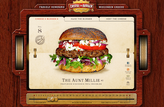
The Best Thing Ever ... cheeseandburger.com literally could (and would) satisfy every temptation. Not only a visual treat but a bloody good excuse to make them!!!
Related Posts Plugin for WordPress, Blogger...