Wednesday, 31 August 2011

Enviro-TYPE


Something to brighten the day ... brilliant use of typography in the environment. Amusing but so tacky that its good!

I know type in the environment is everywhere, from road markings to signs, to street numbers, to shop windows...they consume our daily lives. It seems copy-laden radio commercials, newspaper ads, billboards and logos are also everywhere.

Consumers are exposed to a ridiculous 3,000 advertisements on a daily basis - yet we might only retain a few. These commercial messages have invaded our public consciousness, and whilst many sadly are not remembered, you will undoubtedly remember either the worst, the best or the one that made you stop...and look twice!

Think about what you saw today and what you can remember ... I have a feeling it wont be much... correct me if I am wrong?


Tuesday, 23 August 2011

Giuseppe Mastromatteo

I blogged about Giueseppe Mastromatteo several months ago - and it seems just more of her work keeps popping up over all the trend spots. I still love how she brings poetic Surrealism back to life, and the series 'Indepensense' is a perfect example of this. She uses digital collage techniques to reproduce ears, eyes and faces in the most illusionary and impossible dimensions.
Taking influence from the likes of Man Ray, she represents the most contemporary photography of our time.


Wednesday, 17 August 2011

He would have been a 100!!


Bill Bernbach - an advertising legend, would have celebrated his 100th Birthday on August 13th.
This man who taught me valuable lessons, was widely recognised for leading the creative revolution in the advertising Industry during the 50's and 60's. And for creating the creative structure that most agencies still adopt today!

I studied him in my dissertation - the work he produced, the methods, his style of thinking ... all of which inspired me to work the way I do and will continue to in the future. He based his work on being engaging, interesting, intelligent and most of all believable. He is a credit to our industry and to the way we work, here are just a few of his most iconic from DDB - you will recognise them all.

Happy Birthday Bill !


Seven Dwarves

Seven Dwarves is the latest reality TV show on Channel 4 - I love their exposure and marketing push for the screening which aired this week. The camera filmed residence marks the latest subculture richness that seems to draw us all in ... well most of us - remember ' Big Brother' OR 'My Big Fat Gypsy Wedding?'' And you should know what I mean, it is trying to:

"Break through Panto stereotypes to show how this group of dwarf actors face the challenges of ordinary life head-on."

The marketing material out and about is clever - cliché maybe ... but Channel 4's in-house creative team have done well, they created 20 mini billboards which launched before the show around London, see below. Great stuff!


Tuesday, 9 August 2011

Absolut BLANK .

Absolut Blank from Sérgio Costa on Vimeo.


Absolut BLANK is a campaign created by TBWA, USA - in collaboration with a new generation of artists they have created a global movement that appears to lead the way in contemporary creativity. Absolut have worked with other artists in the past such as Andy Warhol, Damien Hirst and Spike Jonze and now it is their daring nature that provokes me to post this.

I love their passion for the blank canvas ... inspiring other artists to get involved, turning the blank canvas into a collaboration of art and creativity. The 20 artists participating in Absolut BLANK represent a variety of creative disciplines from across the globe; from drawing, painting and sculpting to film making and digital art. See below for Mario Wagner’s attention-grabbing cut-out imagery, and the detailed work of Good Wives and Warriors - they are vibrant and most importantly allowing people to work together. This is something that does inspire me, and hopefully all other aspiring artists too ... as they think about sharing their skills and creative passion.


Tuesday, 2 August 2011

HOUSE Industries


House Industries has long been my friend, not only as a great source of inspiration for typography but for the amazing work they produce. From the printed booklets, screen-printed posters and rendered letters - they produce some of the best work and now they are promoting their Photo-Lettering service.

A little info from their website:

"Known throughout the world as a prolific type foundry, House Industries has made a considerable impact on the world of design. House Industries fonts scream from billboards, wish happy whatever from tens of thousands of greeting cards, serve as the basis for consumer product logos and add elements of style to a wide range of mainstream media. Their typography deftly melds cultural, musical and graphic elements. From early forays into distressed digital alphabets to sophisticated type and lettering systems, House Industries’ work transcends graphic conventions and reaches out to a broad audience. What ultimately shines in the House Industries oeuvre is what always conquers mediocrity: a genuine love for their subject matter."

I received an email just recently - not only was this a great marketing tool but it was interesting and yes! although I am a member I gave in and created a new account just to receive the latest catalogue!! It is promoting their Photo-Lettering Catalogue which has 96 pages of beautiful work - not only is it great work - but usually really nice tactile paper (people who like to smell/touch will appreciate this!!)

So you can sign up and receive your very own & to find out just how nice it is ... and ultimately sign your life away to third parties! But who cares, I love good design!


Wednesday, 27 July 2011

All in the eye of the beholder ...


I was saddened by the death of Lucian Freud on July 20th - he was an incredible artist whose forceful and undeniable physical presence of people and things was a bold example of how he challenges modern notions of pure beauty.

On Another, I read this post today which was so well written I need not re-write it but share the passion with you:

"I've always been interested in extremes, but I'm not interested in doing freaks. I want to paint ordinary people with the attention freaks might get if they appeared in public. I don't want to use the fact that someone may be made differently as a point of interest."

Bold, brilliant and brutal, there are many ways to describe the paintings by Lucian Freud, but all descriptions come down to the fact that he portrayed his subjects with a clear, incisive directness rarely seen in painting today. He studied humanity's flaws with a kind of avaricious hunger, peeling back the layers to reveal the insecurities lying hidden beneath. For the viewer, his portraits were like a light being switched on, a startling clarity that pierced through an anodyne world of airbrushing and makeovers.

He eschewed fashion and art movements and paid little attention to the continual re-appraisal of his work. For him it was blatantly simple; it was all about the painting. Over the years he has painted everyone from the denizens of Soho to benefit supervisors to nobility. Yet each subject received the same unflinching report whether they were the performance artist Leigh Bowery or model Jerry Hall. It is difficult to imagine a painter who will ever have the courage and sincerity to do the same again.

Lucian Michael Freud, OM, CH, was born in Berlin on December 8, 1922 and passed away at his London home on July 20, 2011.

Text by Jessica Lack"

Here are some examples of his work, most famously known is the 'Benefits Supervisor Sleeping' (second image), which sold for a staggering $33.6 million - the highest paid of art ever paid for from a living artist. And the iconic Kate Moss Masterpiece!


Thursday, 21 July 2011

RHYTHM Jerk - MTV idents

RHTHM JERK from MTV WORLD DESIGN STUDIO on Vimeo.

MTV have launched some new idents to define their visual identity onscreen - with four idents in total they have collaborated with agencies such as The Mill and ilovedust.

The one that I think has the strongest creative concept was designed and directed by Carl Addy from The Mill - called 'Rhythm Jerk' which shows five bespoke pop-up toys dancing collapsing and jerking to music. They include Metal Dude, Weather Man, Bangle Gal, Bananamana and Sumo who went through to the final film. The pop-up toys remind me of the childhood toy with the spring underneath that uncontrollably collapses and springs back to life when released. Obviously there was a lot of editing and skill involved to direct the timing of each toys, to coordinate the dancing pattern and movement.

It is a step forward from what MTV have previously done - the more modern and younger approach seems to suit the direction of who they are aiming at and why. Nice work from all of whom were involved!

Friday, 15 July 2011

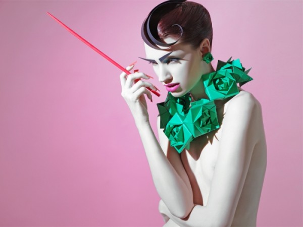
PAPER GANGSTA - SAZELI JALAL

Absolutely stunning Paper Origami creations by Sazeli Jalal.

The beauty series titled "Paper Gangsta" explores colour, skilled craft, photography and drama!! The styling of the palette and model work in perfect harmony - they compliment and enhance one another - telling a picturesque, poetic story.

Beautiful!


Stone Fields


Stone Fields is a project from Novastructura by Italian designer Giuseppe Randazzo - initially inspired by the work of Richard Long and the way he fills lonely landscapes with archaic stones patterns.

I love the 3D patterns created - each one evolves into something different, creating a beautiful piece of art. They are in fact created by a piece of software - too technical to explain or worth mentioning - but the use of how trial and error can create outputs that over deliver the initial brief is what intrigues me. They may be a poor show of the work of Richard Long - but the experimentation involved impresses my naive mind!

Tuesday, 12 July 2011

THE CONTEXT IS THE CONTENT

Dave Trott is a fantastic blogger - his posts are usually quite deep, contextual and require a focused mind - and this post is by no means an easy read, but it is a good read! And the way he explains the point that he is making is an acquired taste - so feel free to skim read but make sure you take it in - because they are insightful and educational - and they may do your business some good!

The Context is the Content

When you’re getting an underground train, do you ever stop to listen to the buskers?
Nope, me neither.
The reason you’re in the underground is to get a train.
You’re not down there to listen to live performances by street musicians.
You’ve got something else on your mind.
And that’s not just in London.
It’s pretty much the same the world over.
I’ve used underground transit systems in New York, Paris, Singapore, Hong Kong, and Tokyo.
I’ve never noticed anyone standing around listening to buskers.
People are too busy getting on with their lives.
Going where they’re going.
The Washington Post recently filmed people walking past a busker.
He was playing classical violin in the DC Metro station, at quarter to eight on a cold winter morning.
About two thousand people walked past him.
Only six actually stopped to listen for a few minutes.
Several young children tried to stop and listen.
But their parents pulled them away.
The busker played for an hour.
Out of 2,000 people who walked past him, 20 dropped money in his violin case.
That’s 1%.
About the return you’d expect for direct mail.
So far no surprises.
The interesting part is the part that isn’t obvious.
The Washington Post had set up the experiment using the concert violinist Joshua Bell as the busker.
The previous week he had sold out a concert hall in Boston, with seats averaging $100 each.
The violin he was playing in that Metro station was worth $3.5 million.
He was playing six pieces by Bach.
The same six pieces he’d played the previous week.
Amongst the most beautiful and intricate music ever written.
The box office receipts at the concert hall were $2 million to hear that music.
Here it was free.
And no one wanted it.
The point is, it’s all about context.
The people who went to see Joshua Bell in concert had prepared themselves for weeks for the experience.
They sat in a hushed hall and concentrated on Joshua Bell on stage.
They stopped whatever else they were doing for that hour.
The people in the Metro didn’t do any of that.
This was just something happening as they went by.
At best an irrelevance, at worst an annoyance.
Now we all know it was actually a beautiful piece of art.
But only in the right place.
In this context it was the wrong thing in the wrong place.
That’s what a lot of people currently working in advertising don’t understand.
They think we’re just here to make a work of art.
An interesting technique, a stunning piece of film, full of delicate nuances, something everyone who’s worked on it can be proud of.
The director, the musicians, the sound engineer, the editor, the digital graphics guys.
They think we’re here to make a brilliant piece of craft.
But where it has to work isn’t a concert hall.
Or an art gallery.
Where it has to work is in people’s lives.
On TV, on posters, in magazines, on radios, on laptop screens.
On the street, in the living room, in the car, at the office.
And yes, even on the underground.
We have to think about this.
Think about the context.
Beautiful pieces of art work in art galleries, and in museums, and in concert halls.
Anywhere where people are expecting them.
Now take a look at the places were advertising has to work.
The other night on TV I saw a commercial that had some terrific animation.
My wife and children all work in advertising.
I told them all about it.
The lighting, the framing, the camera angles, the editing.
They said let’s see it, let’s look it up on YouTube.
The trouble was I couldn’t remember who it was for.
It was a terrific piece of craft, I remembered every single detail.
I just couldn’t remember who it was for.
And I work in advertising.
If I can’t remember it, what chance have the punters got?

I’m not saying don’t do art.
I’m saying do art that works in the context it’s supposed to work in.

Tuesday, 5 July 2011

Philippe Halsman - JUMPOLOGY

Stunning, emotive Jumpology photography by Philippe Halsman.
Pure happiness and emotion captured in one shot - un-staged, and priceless!!

Halsman claimed the jumps revealed character that was otherwise hidden. "When you ask a person to jump, his attention is mostly directed toward the act of jumping and the mask falls so that the real person appears
"

He photographed many comedians and celebrities in the 1950's and here are some of the best.


Ian Stevenson

Ian Stevenson's work will make you laugh - his combination of words and imagery entertains the everyday life, and his use of illustration and comic style approach is funny and light-hearted.

"Ians influences of the everyday strangeness of people and the world around him shines through in his odd world of distorted characters. Drawing on walls, floors, rubbish and anything else he can find, his works bright cheery colours draw you into a sometimes dark world ..."

I loved it - especially the 'butt-cheek woman'.
Check his work out here


HABITAT - THE END.

I was very sad to hear the news of of Habitat last week - the store has history (nearly 50 years of it!), style, modern design and above all recognition. Some may question what it means to shoppers these days? Retro & vintage now cater for our needs and line our shelves, but it seems the some what over-priced items in Habitat just do not compete with the likes of Ikea and Clas Ohlson - very sad but true!


Related Posts Plugin for WordPress, Blogger...